Fantastic Fonts - A Thing of Beauty
INTRODUCTION
I've discussed this in previous videos and posts, but I'm going to repeat myself. I love fonts. A font has such power to portray an image and message. Linguistically they send a message because, well, they're usually letters :-), but there's more to it than that. It might sound a bit strange, but a well-designed font is such a beautiful thing.
Today I want to show you a couple of fonts that I love to use. I did a video in 2016 looking at titles, but things change. Fonts move with fashion, and something I would have chosen in 2016 would probably have shifted down the list now.
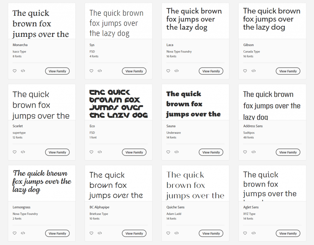
Example Fonts on Adobe Typekit
When it comes to choosing a font, you have two main choices. Firstly, serif or sans-serif and then fancy or subtle. There's more to it than that, but you get the idea.
Once you've chosen your font, you then need to decide how to use it. For me, the top four considerations are size, weight, case and kerning. If your font is going to form part of your brand or image, as opposed to a one-off use, you should decide on the case and kerning and stick to it. Bear in mind that some fonts look awful in lower case. One of our brand fonts at work is designed for use in upper case, but people do break these rules, and it always looks terrible.
MY CHOSEN THREE FONTS
Before I begin, I have to stress that the three fonts I'm looking at today are all commercial fonts. Buying a font might seem crazy to some, especially as there are so many free variants out there, but not to me. It's a worthwhile investment if you regularly produce video containing any titles or text-based graphics.
View Graphik on CommercialType.com
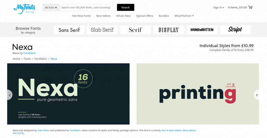
In the video, I am looking at Univers, Graphik and Nexa. I've added links for these above. These are not affiliate links.
This video is just a bit of fun. It's not meant to be massively informative or educational. It's just an appreciation of a few nice fonts!
Let me know if you have any fonts that you love and why. Where do you use them? What is it about them that you like?


